Color is more than aesthetics—it's emotion, memory, and meaning. In branding, your color palette does more than look good; it sets the tone for how people feel about your brand—often before they read a single word.
At Duco İstanbul, we treat color as a strategic decision, not a decoration. Here's how your palette speaks, even when you're silent:
Why Color Matters
Colors are processed by the brain in milliseconds. They're tied to instinct and perception—subconsciously shaping how we judge brands.
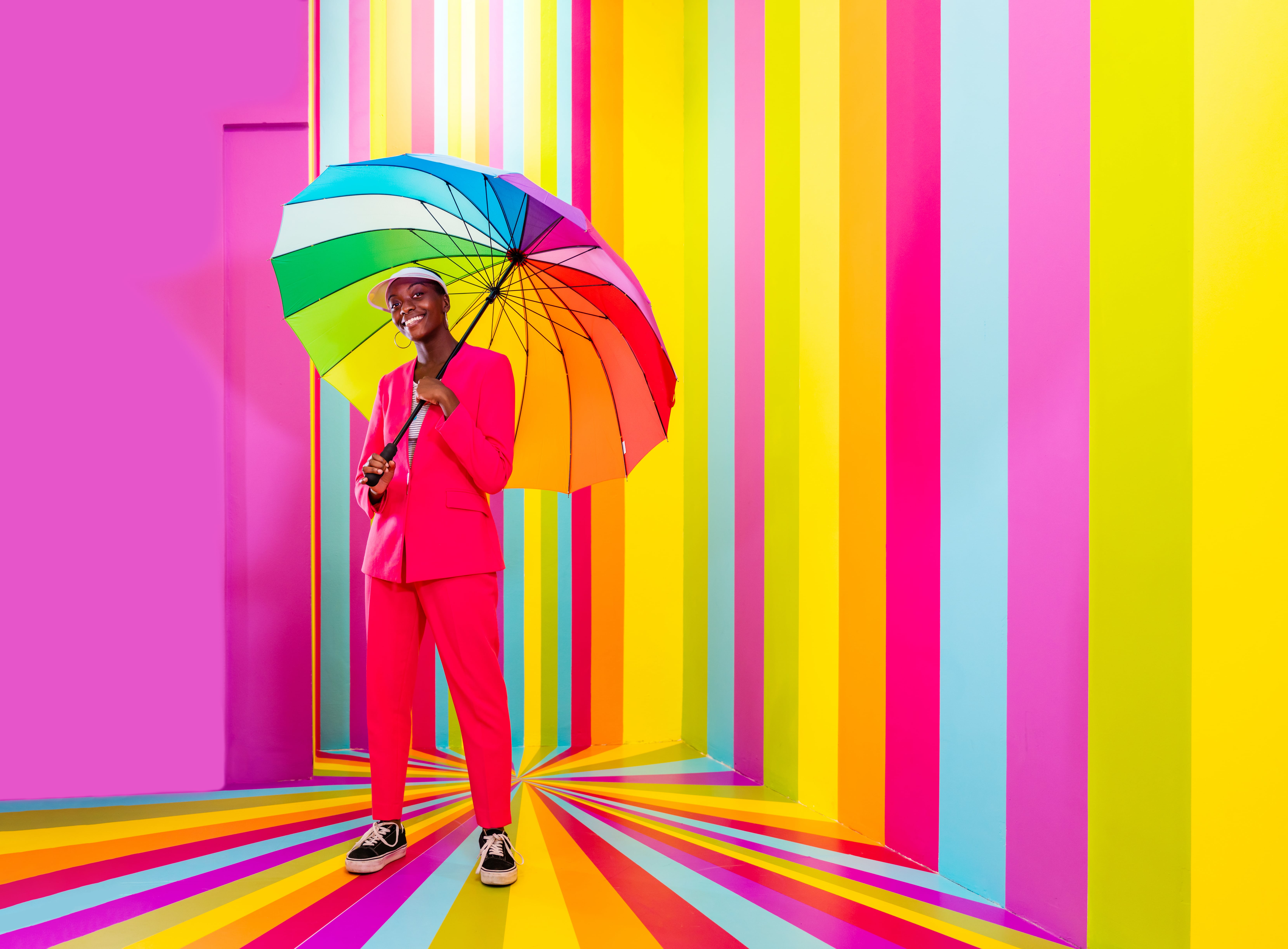
- Red suggests energy, urgency, or boldness—great for startups or entertainment brands.
- Blue evokes trust, calm, and professionalism—ideal for fintech, legal, or corporate sectors.
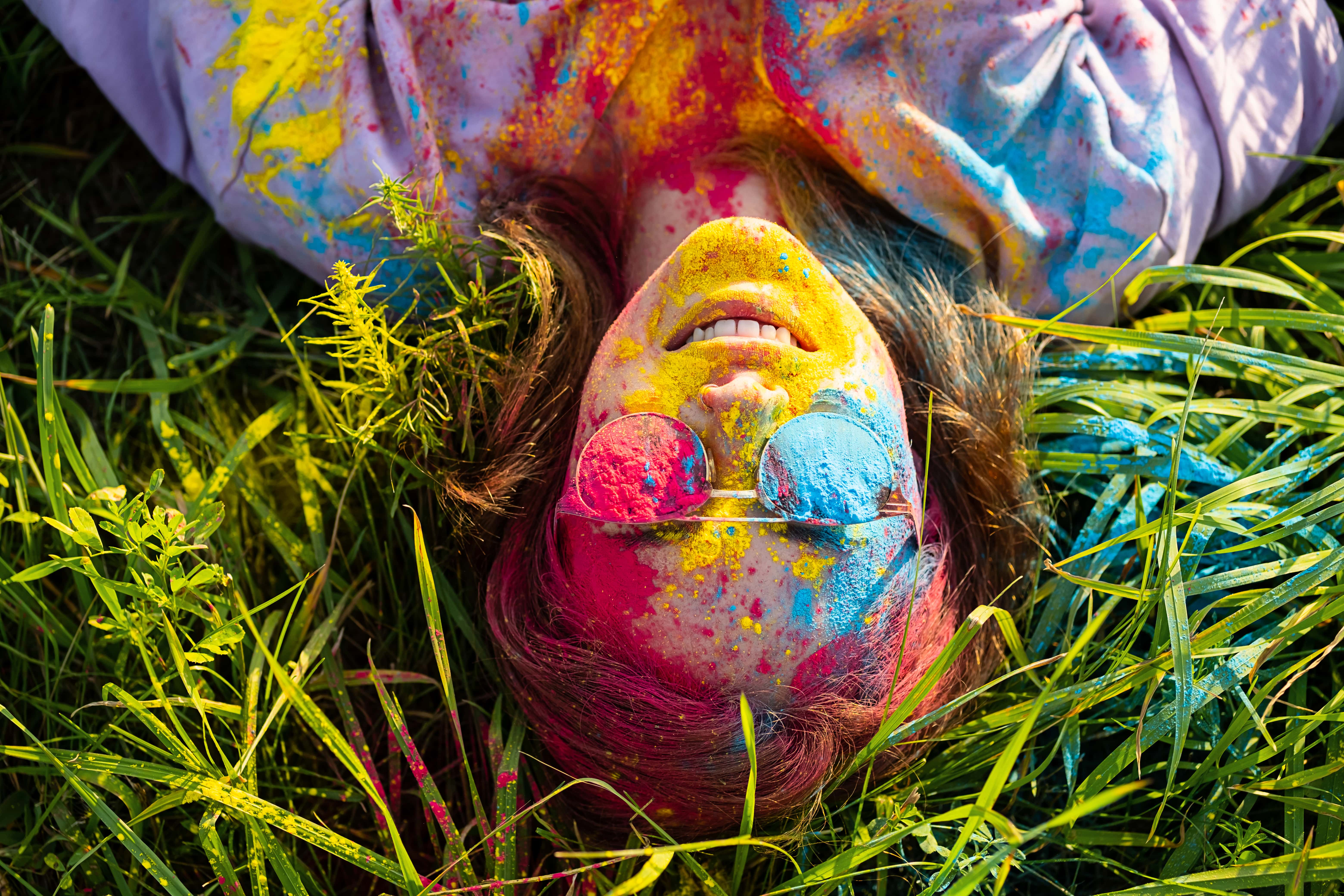
- Yellow sparks creativity, optimism, and approachability—perfect for lifestyle or tech brands.
- Black & White offer elegance, clarity, and modernity when used with intention.
But context matters too: The same color can feel luxurious or childish depending on saturation, pairing, and application.
Color = Emotion = Behavior
A good color palette doesn't just "fit"—it drives decisions. Studies show color influences:
- Purchase intent
- Brand recall
- Perceived credibility
- Emotional connection
In branding, this means a color choice can make or break your first impression.
Strategic Palette Building
Start with your brand's personality
Is your brand playful or premium? Disruptive or grounded? Let these traits guide your color direction.
Think in systems, not singles
A great brand palette includes primaries, secondaries, accents, and neutrals—each with a role, not just a shade.
Test in context
Will the palette work in digital and print? In dark and light mode? On mobile and desktop? Across languages and cultures?
Color is silent—but powerful. Choose it with intention, and it will speak louder than words.